
Well, it just kept bugging me. And I said to myself, leave well enough alone, or you'll screw it up completely. I tried, I swear I did, but that's just not how I'm made. In the end, I knew I would never be satisfied until I at least made an attempt to fix it. This is what I'm talking about: one of the pieces in my "The Traveler's Tale" series. You can see others here, here, and here.

Here's the first version. Well, to be completely honest, it would technically be the second; this was originally an old monotype that I decided to recycle. At this point, it still felt unfinished to me, so I made a few changes:

I warmed up the white in the figure, because I thought she needed to look a little less frozen (or dead?). The blue wave at the bottom was so dark that, visually, there was nothing to hold the eye from sliding off the page, or to bring it back up to the figure. Lightening it seemed to anchor the composition somewhat. I added the starfishes to the sky. I then pronounced it "finished", and put it away.
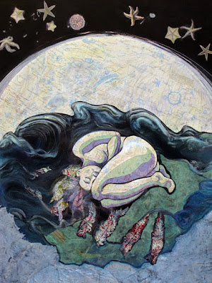
This is the part where I started wasting a huge amount of time and effort, because I felt it wasn't finished. This is kind of embarrassing, but maybe you can learn something from it; I know I did.
The first thing I did was to cut a little off both sides, to bring the focus in closer to the figure. What bothered me most about it, though, was that it had a "velvet Elvis-y" kind of feel, and overall was far too contrasty. I thought it might help to lighten the value of the water surrounding the figure, so I added some green paper which appeared to be pretty translucent- until the glue dried. It turned disgustingly pastel-ish and opaque. It's hard to tell from the photo just how horrible it was, but trust me- yuk!
Next, I tried a blue paper, but it was even worse (you can see a bit of it above on the right side). Apparently I neglected to take a photo of this stage, probably due to being distracted by intense frustration.

Next step: rip and scrape off as much of the paper as possible. At a complete loss for any idea to keep this disaster from snowballing, I could come up with nothing other than to cover it with more of the blue ocean map. Once I had done that, it became clear that it was too light, and therefore not helping the contrast problem at all. Darkening it seemed the only solution, so I added layers of acrylic ink until I thought the value was dark enough (you can see this below). Problematically, the map didn't absorb the ink well, instead building up a gloppy surface somewhat like a floor that's been waxed too many times without being stripped.
At some point I also realized I had forgotten the bird. All the pieces in this series must have a bird- it's symbolically important for the narrative. I actually did two birds. The first was a total fail; the second was okay, except for the color I chose for the lighter value. Oh well- that hardly mattered now, with the whole thing such a mess. What to do?

When in doubt, chop off another piece, of course. Truthfully, I don't recommend this- I was desperate. After that... well, cover up that gloppy blue somehow. Also, I really wasn't fond of the way the water was cut up into pieces. I was digging around in my flat file for a piece of silk tissue, and having no luck finding it, when I came upon some ogura lace paper. Why not?, I thought, and proceeded to glue it on over the map. I then used a purple map to cut new pieces for the bird, and glued it over the green.

Interesting. I think it's an improvement, and at least I don't hate it. So this is where it rests- unless I take a notion to screw it up some more...
Note to self: Try to leave well enough alone.
Not a major fail at all! WHat a process...I really enjoyed reading it and seeing it progress....and I am soooo glad you don´t hate it:).....what a piece!!! Intense to say the least...I was breathing heavily as I kept on reading...I love your persistence! What a piece!!
ReplyDeleteWhat an interesting progression! I like this instinctive approach to the tuning you're doing--especially in this kind of highly symbolic presentation.
ReplyDeleteAll the major pieces were in place in the first version, but by following your gut even more major elements came forth greatly enhancing the work. These adjustments add to the magical/mystical aura that you no doubt were after.
I'm seeing a soul lodged in corporal existence (the man made maps), dreaming of being born into a more ethereal realm. She's in a cocoon or chrysalis--the fiber texture is cool. Thanks for getting rid of the green beach towel--distracting.
The foreground tuning became complete with the addition of green, grounding the piece in a reassuring sense. The blue was icy and dead looking which is obviously not what you are presenting here.
I am immediately uncomfortable as I notice the weird, impish being in the shadow of her 'hair'. It's staring at me. What a device you've used! Now I'm drawn into the scene, and the central figure is not a sleeping girl any more. It's the animus--me--the part that invented the world and all of it's myriad dichotomy--the part that became an artist--the right brain version.
And there's my constant companion with its menacing beak--the anima--the left brain there to spoil the fun (wake me back up into the world).
But soon I will be birthed out of all this, and become whole again. Now I exist in this pre-conscious black wave--womblike in that I can't see it, but it sustains me. I can't even imagine the expanded consciousness I'll be waking up to.
You've made all the right choices in tuning this piece. If anything, I would make a decision whether or not to finally obliterate the 'B' and the 'C' in 'Quebec' [and maybe even the 'Q']--that is unless you mean to attach importance to the country (I don't think you do since the rest of the labeling on the map elements are unrecognizable).
I really like those starfish and the light refracting from behind the globe--very dreamlike. The four fronds are still a mystery to me, but I'm working on it.
I've really enjoyed spending some time with this piece--outstanding work. Bravo.
Wm
What an interesting process to watch. I like the new transformation and hope you stay content with it.
ReplyDeleteIt's finished! Leave it alone now. I, for one, really like it. I think your revisions and futzing really paid off. In fact, it's my favourite of the series thus far.
ReplyDeleteoh sharmon! i love it now!
ReplyDeleteThis is the part where I started wasting a huge amount of time and effort, because I felt it wasn't finished. the number of times i have felt this are beyond counting, and i can't tell you how nice it is to read someone *else* saying it!!
thank you for sharing this with us... : )
xoxo
I always think it's better to go too far than not far enough; you learn more that way. I think each revision did get better. The black sea was too black, so the green paper no matter how gloopy was an improvement. I think the greeny sea you ended with looks better than the blue one.
ReplyDeleteI like all of the ones in this series. They remind me of Jules Verne or Georges Méliès and definitely convey a journey.
beau! une impression de début de siècle...passé!
ReplyDeleteMajor fail? Not.
ReplyDeleteLooks like an epic win for your followers.
How wonderful to visit and see what youve been working on and musing over... and then read the comments... William really nails it... I think you can out your feet up and have that glass of red after this...
ReplyDeleteWonderful Sharmon.. enjoy your weekend!
S
Once again the story of your process gives me courage to continue on with my endeavors... You are an inspirations and your work a marvel. xo teri
ReplyDeletewhat a refreshingly honest post about how difficult it can be to do the work some days. When I get to this point I start sewing over the top!!
ReplyDelete