Monday, June 20, 2011

An Assortment of Cool Stuff to Share

These are just some random things I wanted to share; I thought you might find them interesting and/or helpful, but didn't feel any of them required an entire post.  Most come from my internet wanderings, or from links people send me or post on my facebook wall. 

My son posted the link to this on my facebook profile, about National Geographical photographer, Frans Lanting, and his project which attempts to portray the history of the universe.  Here's a bit of a summary from the project's website.

Frans Lanting’s LIFE: A Journey Through Time is a lyrical interpretation of life on Earth from its earliest beginnings to its present diversity. The LIFE Project aims to bridge the gap between nature and science, and is realized through the integration of photography with the performing arts and the world of life and earth sciences, in collaboration with partners and institutions around the world.  The LIFE Project includes a multimedia orchestral performance, a traveling exhibition, a large-format photographic book, and this website. Public outreach includes an ongoing series of appearances by Frans Lanting at venues across the  United States and Europe, including the TED Conference, Stanford University, the National Geographic Society, the Long Now Foundation, and many others.

Here's the TED version of the slide show, but I encourage you to watch the original full size one at the website; just click on "start the journey."

********************************************************************************

Writer/artist/filmaker Shawn Daniell has a wonderful arts blog called ArtSeen, where you can read arts news, movie reviews, interviews with local artists, and more.


I'm honored to be the featured artist right now on ArtSeen; you can read Shawn's interview with me by clicking here.  Please check out all the other great articles on ArtSeen, too.
                                                                                ********************************************************************************


I really wish I could see this- the Princeton University Art Museum is exhibiting the collage and assemblage work of Kurt Schwitters until June 26, so if you're close to the area you still have a few more days to see it.


From the Princeton University Art Museum website:

"Kurt Schwitters: Color and CollageSchwitters is one of the most influential artists to have emerged in the years following World War I. In response to the turmoil then afflicting German society, Schwitters developed a unique form of artistic practice, one that merged art and life, embraced disparate media, and utilized found objects and printed materials. In 1919, Schwitters christened this body of work Merz —a neologism derived from the German Kommerz (commerce)—which culminated in a series of collages, assemblages, experimental poems, prints, and sculptures, most famously, the Merzbau, a three-dimensional environment initially realized in Hannover in the 1930s." 

So cool, right?
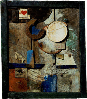


Merz Billdross Fett, Kurt Schwitters

********************************************************************************

Finally, I love this Nick Bantock tribute on Blurb.  Artists from around the world each created a piece in the style of Nick Bantock, and they are all quite inspiring.


Enjoy!

Wednesday, June 15, 2011

Not an Open Book (submission for "The Pulse of Mixed Media")

I created this mixed media altered book/ assemblage as a submission for Seth Apter's book "The Pulse of Mixed Media" to be published in Spring 2012.  While my piece wasn't selected for inclusion, the experience of making it was an invaluable one.  I had done some assemblages in the past, but had never made one from a book, so there was a good deal of trial and error involved.  I ended up taking the cover off the book and attaching it to an old game board, which was not in my original plan.  My good friend Cynnie, of Galerie 46, helped me figure out how to re-construct it so it would open like a book without tearing.  I learned so much from this project, both technically and personally, and hope to create more work like this in the near future.

Here is the text I wrote to accompany my submission:

My Innermost Self- Sharmon Davidson
“Not an Open Book”

Probably the most intensely personal work I’ve ever created, this piece also represents somewhat of a departure from my usual two dimensional format.  The “fairytale book” motif relates to the belief that our most fundamental selves are formed in childhood, and to the important part that fairytales and their illustrations have played in my development as an artist.  Because the innermost self is, by definition, hidden, I have used two locking doors to conceal images symbolizing the two sides of myself.  Behind the left door is the darker side of my nature- the fears and insecurities that hold me back as I strive to become the person I want to be, reflected by the tethered bird who tries to fly.  Like most of us, I have allowed “monsters” of my own creation to frighten me.  The right door reveals self-acceptance, hope, and the potential for positive change.  The vintage pattern pieces were used by my grandmother to make maternity clothes for my mother, adding another layer of meaning to the piece. In the end, I begin to see a pattern for stitching myself together in a new way, and have captured the “monster” inside the egg- a symbol of transformation.  Perhaps my darker nature, too, will transform as the egg breaks open.

(click on photos for closer view)


 front, both covers closed


right front cover


left front cover (with spine)


 left side open


left side,back
 

inside left cover


right front cover


  right cover open


inside front left


inside right


inside back


The words on the back left page come from one of my favorite songs by Paula Cole:


Saturday, June 11, 2011

Real Abstract

If you've been a reader for a while, you've probably noted my fascination with photographing the abstract patterns that result from the interplay of water and light.  If these were painted, would they be masterpieces of abstract art?  Or should I just leave them as photos?  Something to think about.  While some have been altered using Photoshop, others are straight out of camera, or have only been "auto- leveled."   (For those of you not familiar with PS, "auto levels" is just a standard adjustment meant to correct color and contrast to "normal".)  The variations in pattern, color, and form never cease to surprise and amaze me.


This one has had nothing done to it except auto levels, I swear.  Freaky, huh?  If I saw this without knowing what it was, I don't think I would ever guess it was water.


Again, just auto levels...


When I look at these, I know beyond any doubt that I can never create anything so beautiful.  Who do I think I'm kidding, calling myself an artist?  On the other hand, maybe I should paint them; it would be a challenge, and probably lots of fun.  But there they are, already.


Thursday, June 9, 2011

Re- Revised (Major Fail?)

Well, it just kept bugging me.  And I said to myself, leave well enough alone, or you'll screw it up completely.  I tried, I swear I did, but that's just not how I'm made.  In the end, I knew I would never be satisfied until I at least made an attempt to fix it.  This is what I'm talking about: one of the pieces in my "The Traveler's Tale" series.  You can see others here, here, and here.


Here's the first version.  Well, to be completely honest, it would technically be the second; this was originally an old monotype that I decided to recycle.  At this point, it still felt unfinished to me, so I made a few changes:


I warmed up the white in the figure, because I thought she needed to look a little less frozen (or dead?).  The blue wave at the bottom was so dark that, visually, there was nothing to hold the eye from sliding off the page, or to bring it back up to the figure.  Lightening it seemed to anchor the composition somewhat.  I added the starfishes to the sky.  I then pronounced it "finished", and put it away.


This is the part where I started wasting a huge amount of time and effort, because I felt it wasn't finished.  This is kind of embarrassing, but maybe you can learn something from it; I know I did.

The first thing I did was to cut a little off both sides, to bring the focus in closer to the figure.  What bothered me most about it, though, was that it had a "velvet Elvis-y" kind of feel, and overall was far too contrasty.  I thought it might help to lighten the value of the water surrounding the figure, so I added some green paper which appeared to be pretty translucent- until the glue dried.  It turned disgustingly pastel-ish and opaque.  It's hard to tell from the photo just how horrible it was, but trust me- yuk!

Next, I tried a blue paper, but it was even worse (you can see a bit of it above on the right side).  Apparently I neglected to take a photo of this stage, probably due to being distracted by intense frustration.


Next step: rip and scrape off as much of the paper as possible.  At a complete loss for any idea to keep this disaster from snowballing, I could come up with nothing other than to cover it with more of the blue ocean map.  Once I had done that, it became clear that it was too light, and therefore not helping the contrast problem at all.  Darkening it seemed the only solution, so I added layers of acrylic ink until I thought the value was dark enough (you can see this below).  Problematically, the map didn't absorb the ink well, instead building up a gloppy surface somewhat like a floor that's been waxed too many times without being stripped.

At some point I also realized I had forgotten the bird.  All the pieces in this series must have a bird- it's symbolically important for the narrative.  I actually did two birds.  The first was a total fail; the second was okay, except for the color I chose for the lighter value.  Oh well- that hardly mattered now, with the whole thing such a mess.  What to do?


When in doubt, chop off another piece, of course.  Truthfully, I don't recommend this- I was desperate.  After that... well, cover up that gloppy blue somehow.  Also, I really wasn't fond of the way the water was cut up into pieces.  I was digging around in my flat file for a piece of silk tissue, and having no luck finding it, when I came upon some ogura lace paper.  Why not?, I thought, and proceeded to glue it on over the map.  I then used a purple map to cut new pieces for the bird, and glued it over the green. 


Interesting.  I think it's an improvement, and at least I don't hate it.  So this is where it rests- unless I take a notion to screw it up some more...

Note to self: Try to leave well enough alone.


Saturday, May 28, 2011

It's Your Turn to Invent the Universe This Time


It's Your Turn to Invent the Universe This Time (I'm Out of Tape)
6" x 4"
Ingredients: map fragments, vintage sheet music, vintage book page, acrylic ink, acrylic gel medium, magazine cut-outs, tissue paper, Koh-i-noor pen, watercolor pencils on multi-media art board


There is a theory which states that if ever anyone discovers exactly what the Universe is for and why it is here, it will instantly disappear and be replaced by something even more bizarre and inexplicable. There is another theory which states that this has already happened.  
   -Douglas Adams


Tuesday, May 24, 2011

An Hors D'oeuvre (without a funny title)

I just noticed yesterday that I've only done 2 posts so far this month.  Time has raced by so unbelievably fast, with the end of the school year (only 2 more weeks- and only 1 of those with the kids!), mountains of special ed. paperwork, and general exhaustion.  I feel like I've been working so hard, and with nothing to show for it!  I've even forgotten to welcome my new followers, and I sincerely apologize.  I'm so grateful to all of you, and hope you enjoy coming along on my adventures.

Just so you don't think I'm a total slacker, here's a little hors d'oeuvre. I'm sorry about the blurry photo, but my scanner does not like lumpy things. Also, I couldn't think of a good title for this one.  The best I could come up with was "Ashes to Ashes, and Dust to Dust in the Wind", but that just didn't get it for me.  Feel free to make suggestions.

Ingredients: map fragments, vintage book pages, vintage ledger page, watercolor pencils, copper crayon, image transfer.

In the meantime, I am working on the salad and main courses- coming soon, I promise!