Tuesday, April 5, 2011

A Little Color

It could be said that I'm addicted to color, and I would freely admit it.  I don't know about where you live, but here, it's been, as George would say, (little darlin') "a long, cold lonely winter".  I'm ready for Spring, I'm tired of gray and brown, so I say here comes the color!

Marketing researchers have spent considerable amounts of money trying to figure out the psychological effects of colors.  Of course, it's not an exact science, because each person has his/her own unique associations with colors, resulting from personal experience.  But there are some associations that tend to hold true for most people.  See if you agree.


WHITE

  • purity
  • innocence
  • cleanliness
  • sense of space
  • neutrality
  • mourning (in some cultures/societies)


GRAY


  • neutral
  • timeless
  • practical


 BLACK


  • authority
  • power
  • strength
  • evil
  • intelligence
  • thinning / slimming
  • death or mourning


RED


  • love
  • romance
  • gentle
  • warmth
  • comfort
  • energy
  • excitement
  • intensity
  • life
  • blood


ORANGE


  • happy
  • energetic
  • excitement
  • enthusiasm
  • warmth
  • wealth prosperity
  • sophistication
  • change
  • stimulation


YELLOW


  • happiness
  • laughter
  • cheery
  • warmth
  • optimism
  • hunger
  • intensity
  • frustration
  • anger
  • attention-getting


GREEN


  • natural
  • cool
  • growth
  • money
  • health
  • envy
  • tranquility
  • harmony
  • calmness
  • fertility


BLUE

  • calmness
  • serenity
  • cold
  • uncaring
  • wisdom
  • loyalty
  • truth
  • focused
  • un-appetizing


PURPLE

  • royalty
  • wealth
  • sophistication
  • wisdom
  • exotic
  • spiritual
  • prosperity
  • respect
  • mystery


PINK


  • romance
  • love
  • gentle
  • calming
  • agitation


BROWN


  • reliability
  • stability
  • friendship
  • sadness
  • warmth
  • comfort
  • security
  • natural
  • organic
  • mourning (in some cultures/societies)


Some of the associations seem a little odd, but for the most part, they make sense to me.  I got the color association information from a cool art therapy website; you can read more about it here.


Now that we've considered each color separately, lets mix them all together, shall we? 

These incredible large-scale installations by Mexican fiber artist Gabriel Dawe certainly encompass the entire color spectrum. 

Plexus 3 by Gabriel Dawe

Plexus 3


Plexus 2 by Gabriel Dawe


Plexus 4 by Gabriel Dawe

To see more of Gabriel's work, visit his website, here.


And now, for the final color overdose; check out this video of artist Holton Rower at work!  (Turn up the sound, too; the music is great.)


I find this video mesmerizing!  Okay, maybe I am easily amused, but I hope you enjoy it as well.  I also hope you enjoyed my little color tour!  Thanks to my son, Colin Reusch, for sending me the links to these two artists.

Sunday, March 27, 2011

Silly Questions

Some things to ponder...

 If the supermoon was so super, why couldn't I get a super photo of it?


1. If we can't walk on water, what are the chances we can sit on it?
2. Is it a park, a pool, or a river?


How come no one says, "What, what, goose butt..."?  


Do these numbers seem upside-down to you?  Shouldn't 45 be higher than 15?


If my daughter is engaged, does that make me older than God, or just older than dirt?

Saturday, March 19, 2011

Raven and Crane- part 2


As Raven spread his inky wings to fly, darkness spilled out from beneath them, filling the emptiness with all the pieces of the mysterious Night.  The beautiful Moon sailed through the sky, and the darkness was dotted with countless swirling stars.  The Moon's glowing face spun slowly out of hiding until her full roundness was revealed, and then back again.

See part 1 here.


- This story is my own, and does not intentionally draw from any existing story or myth. The style and inspiration come from the traditional creation myths of many cultures, including Celtic and Native American.


Sunday, March 13, 2011

Re-Vision

I don't usually do collages that don't contain some of my own drawing or monotype work, but I thought I'd give it a try.  Why I thought that, I don't really know, since I'm generally quite terrible at this type of work.  In my last post, I included a collage I had made by combining different papers.  In keeping with the theme of clouds and rain, my intention was for the piece to express that mood, so I wanted to do something a bit simpler, softer, and more monochromatic than my usual riot of intense color and contrast.  (Okay, stop laughing; it is too possible!) The result was less than satisfactory; in fact, it was boring.

As I sat looking at this piece and pondering what might be done to improve its awfulness, I though perhaps I had been over-confident; maybe I should have started small.  "Go big or go home" is not always a sound philosophy.  So, I began cutting it into smaller pieces, which seemed at once to be an obvious improvement.  I worked on each one individually, while still keeping them similar enough to work as a series.

Symphony of the Rain (Overture)  4.75" x 5.75"


Symphony of the Rain (First Movement)  6.25" x 6"


Symphony of the Rain (Second Movement)  5" x 5"


Symphony of the Rain (Third Movement)  6" x 4.75"

Ingredients (all 4 pieces):  vintage ephemera, decorative papers, magazine cut-outs.


What do you think?  Better, or not?  Any and all advice would be helpful!

Sunday, March 6, 2011

The Time of Gray

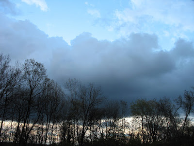
It's the time when all you see is gray...


It weighs down the sky...


wrapping hills and trees in delicate layers of gray tissue.


And then it begins....

Symphony of the Rain
ingredients: vintage type paper, vintage piano book page, magazine cut-outs, various decorative papers


Tuesday, February 22, 2011

Strange and Amazing

During my recent internet excursions, I've come across some very unique art. You've got to see these!


I've never seen anything like this.  Jason de Caires Taylor makes life-size cement sculptures, then submerges them in the ocean... 


With the passage of time, they become habitats for the little sea creatures, who gradually alter the appearance of the sculptures.


You can see more photos of this amazing installation and read the entire article, Drowning Beautiful,  here.  I encourage you to visit his website, where you can read more about his work, and watch the lovely videos that provide extended, 360 degree views of the works in situ.


Next, I'd like to direct your attention to the work of Siba Sahabi, an artist whose stated intention is to "build a bridge between the orient and the occident."

From  "Bucchero" series

 I don't know about that, but I know that what she has built is incredible- all these pieces are made of paper!

Paper!  Seriously??

"Bucchero" series

It seems to beg all kinds of questions, such as, to begin with- HOW?  I can't even imagine how you'd begin, and then, how you would keep it so perfectly round and even?


And how long would it take to make one?  I mean for her, not me, because it would obviously take me the rest of my life...
Kerameikos paper porcelain


And while we're on the subject of the completely unbelievable...


Have you ever seen the pencil lead sculptures of Dalton Ghetti?  Take a closer look...


Yep, that's right- pencil lead.


I'm completely dumbfounded.  This guy must have amazingly steady nerves, not to mention uncommonly acute eyesight.


Dalton Ghetti uses only a razor blade, sewing needle and sculpting knife to carve these minute works. According to this article, he even refuses to use a magnifying glass and has never sold any of his work, only given it away to friends.  Though he doesn't have a website, you can find several good articles if you google his name.  He also had a show at the Silvermine Art Center in Connecticut.


This one took him two and a half years.  Are you amazed yet?

Sunday, February 13, 2011

Art Club + Butterfly Project = Awesome

The art teacher and I sponsor an after-school art club at the middle school where I teach.  I thought the kids might like to make butterflies for the Butterfly Project, an online art collaboration organized by Trudi Sisson of Two Dresses Studio.  All of the butterflies sent to her will be displayed on Trudi's blog, so the students were pretty excited about the prospect of getting to see their creations on the internet.  They couldn't believe their work would someday be on display in the Holocaust Museum in Houston.

We gave them a wide range of media choices, lots of materials, and let them go at it.  All they had to provide was the creativity, and there was certainly no shortage of that!


Here are their creations, ready to send to the Butterfly Project.  How cool is that?  I'm so proud of them!

If you want to join, click "Butterfly Project" above, or you can click the icon on my side bar.  Happy flying!


I was just notified by Seth Apter of  The Altered Page that my entry will be featured in today's posting of  Collector's Edition: Chapter 7.  This is part of a huge ongoing series of collaborative online art projects that Seth dreamed up and has been coordinating for some time now, called The Pulse: The State of the Art. I'm so grateful to be a part of this amazing project, as well as a part of the online art community it chronicles.  There is lots of cool artists' stuff  featured today, so get on over there and check it out!