Showing posts with label image transfers. Show all posts

Wednesday, November 2, 2016

Taking Refuge


Taking Refuge
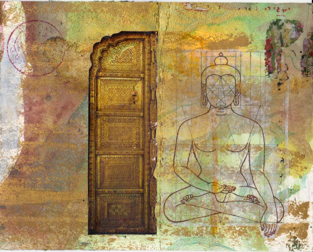
ingredients: antique handwritten letter fragments, Italian currency, vintage ephemera, image transfers, ginko leaf, monoprint


To take refuge is to commit oneself to the Buddhist path. According to Chögyam Trungpa Rinpoche:

"In the Buddhist tradition, the purpose of taking refuge is to awaken from confusion and associate oneself with wakefulness. Taking refuge is a matter of commitment and acceptance and, at the same time, of openness and freedom. By taking the refuge vow we commit ourselves to freedom.

“I take refuge in the Buddha.
I take refuge in the dharma.
I take refuge in the sangha.”

So becoming a refugee is acknowledging that we are homeless and groundless, and it is acknowledging that there is really no need for home, or ground. Taking refuge is an expression of freedom, because as refugees we are no longer bounded by the need for security. We are suspended in a no-man’s land in which the only thing to do is to relate with the teachings and with ourselves."


Wednesday, April 1, 2015

Accordion Book


Just for fun and self- encouragement I made this little accordion book, containing some positive sayings along with the images. I used a piece of Rives BFK printmaking paper which already had a bit of paint on it, and added more drawing and collage elements on top of that...


The front (or back, depending on how you look at it)...


 pages 1 - 3 on the other side... image transfers of Avolkitesvara, and my own photo of the forest...


 pages 4 - 6... some collage bits and a little woodblock print, a drawing of a sprouting seed, and some more image transfers of plant parts... (You can't control what happens, only your own reaction to it.)  (Forgive yourself, mistakes are lessons.)


 pages 7 and 8... image transfer of plant parts, a stamped gold frame and cut out of a lily... (Success is the sum of small efforts repeated day in and day out.)


 pages 9 -11 (the other side)... a combination of acrylic ink painting,drawing, and collage... (You, as much as anyone else, deserve your love and affection.)


pages 12 - 14...acrylic ink painting, collage, woodblock print, drawing, metallic crayon... (What you think, you become.)  (Happiness depends solely on what you think.)


pages 15 and 16... acrylic ink painting, collage, woodblock print, drawing, metallic crayon...


I'm not sure if I'll put covers on it, but probably not, as they would cover up some parts that I really like. Don't know exactly what I'll do with this, but it was fun and therapeutic to make... hope you enjoyed it!


Monday, June 11, 2012

The Process So Far

A couple of posts ago, I showed you the new altered book piece I'm working on, entitled Book of Dreams. A lot has happened since then- I got a new computer, the school year (finally!) ended, the Figuratively Speaking exhibit opened, and then, on Sunday- I broke my ankle.  I still can't believe it myself- just strolling along the creek side, anticipating a fun and leisurely search for good junk that the Spring rains might have washed down to the island (or, as the ER nurse put on the report, "looking for art materials"), I put my foot on a rock, slipped, heard a snapping sound, and found my self lying in the rocks and mud.

So, my point is, somewhere in between all those events, I was still working on the piece, a bit at a time. Not so much since the ankle fiasco, which I think you probably could have already deduced on your own, right?  And, since I did not hit my head when I fell (why did the ER staff keep asking me that?), I still remember that I had promised to give you a step-by-step overview of my process.  So, here goes.


I started with the front cover, which I envisioned as the gateway to the realm of dreams.  I wanted to use the sphinx from a piece I had made and sold several years ago, so I used photoshop to cut out the figure, then printed it out to use as a transfer.  My idea here was to do an acrylic gel transfer of an inkjet image, hoping that, if I lucked out, the resulting poor-quality transfer would have the appearance of a worn, faded illustration on the cover of a very old and forgotten storybook. (Gel transfers work best with toner-based ink, not inkjet.)  I knew it would probably be a big bloppy mess, but I gave it a try, and to my great surprise, it worked perfectly.  Unfortunately, the acrylic medium soon began to peel off the surface of the book cover, which was more smooth and slippery-feeling than covers I'd previously work on. Ultimately, I had to peel it off and re-do the transfer four more times, including a good deal of sanding, gessoing, and scraping; it never did look as good as it had the first time, though.

Before doing any more work on the sphinx, I glued on the map pieces and dress pattern piece that form the bottom/foreground, as well as the dress pattern pieces that form the rectangular 'door' area.  Images of cuneiform characters were transferred onto the rectangular door, and transfers of the botanical illustrations were layered on top of the other images.  Acrylic paint, inks, watercolor pencils and crayons, and artist pens were used to enhance the sphinx and other parts of the drawing.

I used my awl to punch holes in the book cover for the stitching, which was done with embroidery floss. After quite a bit of debating, I decided to make the letters for "Book of Dreams" from the cuneiform characters, cutting, turning, and/or altering them to make them look like English letters.  Though it initially seems to work, I'm not sure how I feel about it yet.

The "door" is an old brass escutcheon that I bought on etsy, and attached with brads; the "doorknob" is strange sort of screwpost thingamabobby I bought somewhere.


Well, that's the first installment; I hope my explanations were more helpful than confusing.  I'm never sure if I'm including enough information, or rattling on way too much, so please let me know.  If there are things I didn't explain well, or you just want to know more than what I addressed, please feel free to ask.  Likewise, if there are easier or more efficient ways to do things, don't hesitate to share these with me.  I'll also be talking more about some of the materials I use, as I continue to share my process throughout this project.


Thursday, May 10, 2012

I'm still working...

Even though I haven't been posting much, it's not because I'm not working; it's just difficult to process photos right now.  But I did want to give you a little peek at what's going on in the studio.  I'm hoping I was able to make the photo small enough so that it can download without too much trouble.  I guess we'll find out!


This is a work in progress called "Book of Dreams."  An art organization (The Print Club) of which I'm a member will be having an exhibit at Northern Kentucky University in February, with the theme "In Your Dreams."  As of now, I plan to exhibit this piece, along with some others, if it's not "an epic fail", as my students would say. This is just the front cover, and even it has a long way to go.

Ingredients so far include: vintage book, maps, vintage dress pattern, image transfers, watercolor pencils (Derwent), artist pens (Pitt and Artline), acrylic ink.


I'll try to remember to take photos of this as it evolves, and post them regularly.  Also, I'll attempt to describe the process in a somewhat step-by-step manner, beginning with the next post, because right now I'm doing special ed paperwork!

And, as always,

Shepherd Fairey


Wednesday, August 10, 2011

New Work in Progress

With the prospect of the beginning of a new school year in just a few days hanging over my head, my goal has been to finish, or at least get a decent start on, my next altered book cover before school starts.  I'm feeling pretty good about where this piece is going (if not quite as good about where I'm going), in spite of some struggles with problems that I've hopefully remedied.  Here is the left side of the piece as it stands now:


The book page and end paper are from a vintage book of Longfellow's poetry and other writings, and the plant with roots as well as the petunia are image transfers of illustrations from a vintage botany textbook.  I don't know if you can see the little map scrap at the top right; it says, 'Old Davidsonville State Park'.  (You can probably read it if you click on the image.)  The odd thing about this is that it just showed up on my drafting table, and is not from the map I was using for this piece (which is now mostly torn off and underneath several layers of other stuff).  I just happened to look down, and there it was- and I took no notice of it really, until I realized there was a familiar name on it.  I guess it must have been in among some other things I pulled out of one of my scrap drawers.  I have no idea where this park is; if you do, I hope you'll let me know.

I apologize for the poor quality of the photo; I just quickly stuck this on the scanner, and it's not entirely flat, so some of it doesn't show up well.  I'll be posting better photos of further progress in the next day or two, and also explaining some of the meaning behind this piece.  

Just so you know, blogger is not always letting me leave comments on others' posts, and I'm having great difficulty uploading photos; once uploaded, it sometimes won't allow me to add them to my post.  What's up with that?  Maybe I shouldn't have made that comment about blogger and I not being on friendly terms... should I apologize?


Sunday, June 27, 2010

Collage Workshop with Randel Plowman

What could be more fun than learning new techniques from collage artist Randel Plowman?  You're right- nothing!  I had the privilege and pleasure of attending Randel's collage workshop at Northern Kentucky University yesterday.  The time flew by as we learned about possibilities for collage materials, various types of glues and mediums (I love glue!), image transfers, and lots of other cool stuff. 

Our first project was a series of 2 1/2" by 4" five-minute collages, using materials given to us in a little plastic bag- yikes!  Just the thought of having to do anything in five minutes is scary for me, as I am normally a perfectionist with two speeds: slow as molasses in January, and slower than molasses in January. This was a great loosening-up exercise, and I actually started to enjoy it, because who expects greatness in five minutes?  Here are some of my results:


We also learned an interesting technique for making collages using heat from an iron.  It was kind of labor-intensive, but I liked the results because the pieces turn out so nice and flat.


Then we tried some image transfers.  The piece below was my best attempt; I call it "Happy Rooster" because I was so happy with how it turned out!


Randel was extremely generous with both his knowledge and materials, and gave us lots of freedom to play and explore.  I also enjoyed meeting and interacting with the other artists at the workshop.  There were graphic designers, teachers, print makers, hobbyists, writers and who knows what else, all there to learn about collage.  What a great way to spend a hot, humid Saturday!

Monday, October 19, 2009

A Little Irony

I know you've all been up nights, anxiously anticipating my first image transfer- ha! Seriously, though, I did learn a few things from this experience, which I will now share with you.

1. Things are never as simple as they seem.

I wanted to put a castle up on the hill. The original is a pen and ink drawing I had done when I was a teenager. (Yes, they did too have pens and ink back then!) I didn't want to use the original, of course; also, it was the wrong size. So I scanned the drawing and reduced it to the proper size, and changed the ink color from black to brown, because I wanted that etching-y kind of look.


At first I thought I would just print it onto acid free paper and glue it on. But NOOOOOO, I couldn't do that! Too easy. I started thinking that the ink can run or smear when I get glue on it, so maybe an image transfer would be better.
I didn't have a lot of time to mess around with learning how to do image transfers, so I thought I'd take a shortcut, so to speak, and use Lazertran transfer paper. I happened to notice this product as I was browsing through the Dick Blick catalog. It's supposed to make easy waterslide decals, which can then be stuck onto anything. It looked cool, and I love to have art supplies fed-exed to my house, so I ordered it.

2. You never know what you're gonna get.

I read the directions, and it seemed pretty simple. I printed the image onto the Lazertran paper.


Though it looked fine on the monitor, it was way too dark once printed. So I tried again. Too light this time. I finally got one that I thought was just right.

3. You can waste a lot of time trying to save time.

Now, to put it on the actual artwork- YAY! I waited for the ink to dry, soaked it in water for a minute, and it did, indeed, slide right off. There were two surprises, however. It was not at all sticky on the back as advertised. No big deal- I am the queen of glue. The other surprise was that the decal was practically transparent. The package, I thought, said it had a white backing. I guess they meant the actual paper that you take it off of...yikes! So now I have to glue it onto a piece of white paper anyway...


This would actually be pretty dang hilarious, if it wasn't for the fact that it was almost impossible to glue it onto the paper. The decal is so thin and delicate, it rips if you so much as look at it funny! Every time I put the slightest pressure on it to get the glue out from underneath- another rip!! By this time, the expression on my face looks something like this:


4. Live and Learn.

I've finished the gluing, attempting to carefully repair all the rips as best I can. I cut it out and tape it up on the piece to see how it looks, and now I think it may be too light! Can you believe it?!


So I'll probably end up just printing it on acid free paper after all....AAARRRGH!