Friday, June 29, 2012

Book of Dreams Ist pages complete!

In our last episode, we saw what we thought was the final version of the 'floating girl' spread.  Sadly, I was mistaken about that- or, sadly mistaken, as my mom used to say.  I realized that the white specks I was seeing on the photos were at least partially caused by little tiny spaces where the colored pencil wasn't covering the oil-based ink of the monotype beneath it.  So, like an idiot, I repainted the entire figure,  except for the dress. That set me way back, because I was never satisfied, and therefore kept painting over what I had already painted over... Finally, I just said to myself, Stop now before you go crazy. And the surprising part is- I actually did.  Stop, I mean.  (Crazy is a whole other can of worms, which I won't go into right now.)

Now I'll go back to what I did before that, in real time.  Prior to and partially during the work on the monotype part of the spread, I had to prepare the pages in the book onto which it was going to be glued.  On both sides, I stuck the first 3 pages together to create a thicker, sturdier surface to attach everything to.  (I could not yet glue them to the book cover because I knew there was going to be stitching.)  I laid the monotype down to determine where its placement and drew around the edges so that I would know what portions of the pages would be showing when the whole spread was assembled. After gluing down some collage elements such as vintage book pages, maps, and sewing pattern pieces, image transfers of the same cuneiform letters I had used on the front cover were added.

left side collage

These were followed by the eggs, which had been printed on tracing paper.  the paper wrinkled when I tried to glue it into place, but I liked the effect, so I left it. Lastly, the stitching was done.

right side collage


right side detail


 After finishing the stitching, I glued the left side page to the back of the book cover.  I also used some book-binding tape in an attempt to further strengthen the attachment of the pages to the cover.  (You can't see all of that here.)


 At that point, it was time to glue the monotype (floating girl) into place.  But first, there were a few more details to take care of- just little tweaks here and there.  The only change of note was the addition of the feathers...


which were generously donated by my friend's pet parrot.  So here's the final version...


I think...                                           

What do you think?


Friday, June 22, 2012

Inspiration Abounds + The Pulse

First of all, I want to thank my new followers; I always feel it's a great compliment when someone follows my blog. I'm grateful to have you along for the ride.

Secondly, I'm happy and honored to have my photo featured today in Chapter 4 of Still Life, part The Pulse, an ongoing online collaborative project by Seth Apter of The Altered Page.  Seth is an inspiration to me because he seems to get 10 times as much done as any other person, and still manages to be a genuinely nice guy.  I'm pretty sure that if did all that, I'd be tired and cranky!  If you haven't seen the earlier editions, please check them out as well; there have been a wonderful variety of still life photos by amazing artist-bloggers who you may not have met yet!


I've enjoyed perusing all the photos so far; it's interesting to see what they reveal about the artists.  Sometimes the photo seems to "fit" them completely; others you would never guess in a million years. And you'll find many fascinating new blogs to explore.


Inspiration can mean many things to many people.  According to Wiktionary, inspiration means:
  1. The act of inspiring or breathing in.
  2. breath
  3. The drawing of air into the lungs, accomplished in mammals by elevation of the chest walls and flattening of the diaphragm.
  4. The act or power of exercising an elevating or stimulating influence upon the intellect or emotions; the result of such influence which quickens or stimulates; as, the inspiration of occasion, of art, etc.
  5. A supernatural divine influence on the prophets, apostles, or sacred writers, by which they were qualified to communicate moral or religious truth with authority; a supernatural influence which qualifies men to receive and communicate divine truth; also, the truth communicated.
 I was inspired by a visit to the blog of my friend Lynne Hoppe, who, in a couple of recent posts, featured glorious photos of some wild flowers that grow near her home in northern California.   Right now I'm referring to definition #4, though her posts are definitely also a breath of fresh air.  The flowers she posted reminded me of the astonishing beauty of similar ones I had seen in Glacier National Park, in Montana.  I live in Kentucky, so our wildflowers are completely different from those of the northwest.  (If you want to see what Kentucky wildflowers look like, I posted some photos of them here, here, here, here and here.)  Anyway, when I saw Lynne's photos, I was inspired to look at my wildflower photos from Glacier, and they made my eyes so happy, I thought, why not post them so people from all kinds of different places with all kinds of different wildflowers can see them too?  So that's what I did.  I hope you will enjoy them as much as I do.


gentian


glacier lily


indian paintbrush


bear grass and ?


 forget me not


 columbine- these we do have in Kentucky


geranium


 saxifrage?


indian paintbrush


bear grass- Can you tell it's my favorite?


 bear grass, indian paintbrush, and ?


I apologize for not having identified most of the plants; I will hopefully look them up and make an addendum in the next day or so.


Wednesday, June 20, 2012

The "Book of Dreams" Project: Monotypes, Recycling, and Binding (Oh, My!)

Hello all! Now that I can get out a bit (at least on the porch) I hope my photos will improve somewhat.  I had to discard some of the ones I took inside, because the flash reflected off the shinier parts of the piece, making it difficult to see what it actually looked like.  Of course, I will unify everything when it's finished, by using the proper surface coatings, but I'm not ready to do that yet. With the varied surfaces that are unavoidable when using mixed media, this is another issue that has to be resolved in the end.


This is part of the first inside page spread for the Book of Dreams.  Since the text block of the original vintage book has largely come loose from the cover, I thought that if I used single page 'signatures' (I know they're not really signatures, but I'm trying give you a clear visual here- and probably not succeeding.), made from sturdy, durable material, it would help to bind the pages to the cover more securely.  Not really being very experienced with book-binding techniques, I'm not sure if this will work, but it seems logical to me.

What I decided to do, then, was to recycle parts of an old monotype that wasn't successful.  It's a  method that usually works out well for me, because it gives me layers of color and images on which to build.  Being a big layer-er, it functions as kind of a head start, and the additional layers tend to yield a richer piece with increased depth.  Of course, I first needed to come up with a scrap piece that fit in with my vision; I had an idea of the one I wanted to use, and luckily it worked out.

First I played around with fitting the appropriate section of the scrap piece to the page; when satisfied with the composition, I cut out the parts I wanted.  In this particular case, the figure was already there, but had to be significantly modified.  I won't describe all this in detail, but one major thing I changed was her dress, which looked really floopy.  (Yes, this is a word, at least in my head...)  I took a piece of gampi (also called silk tissue) and tried to make it fold where the folds in the dress should be, gluing it down with gobs of acrylic medium as I went.  Though it didn't turn out the way I had hoped, I decided it was acceptable; to me, it looked a bit like encaustic, or maybe like her dress was made of ice, or water.  Sometimes, you just have to go with the flow, people.

The wing was added, part map and part feathers (the feathered part came from Wing of a Roller by Durer), and then the stitching to connect them.  I made several other changes and additions- everything from adding more grass, as well as the egg and the bird, to changing the shadows, and removing things from the sky and other areas.  The thing I love about Rives BFK is that it can take the abuse of some pretty aggressive washing and erasing.  I did still tear up a few spots; this is where creative improvisation comes in (otherwise known as gluing something over it if all else fails).


This post is getting longer than I intended, so I think I'll continue later with the alterations and collage work I did in the pages of the book itself before gluing the monotype in place, and, of course, with the completion of this spread.  Be sure to check back for that update, and as usual, I'd be happy to answer any questions you may have about materials, methods, or techniques.  Also, I would love to read your ideas and advice, if you're so inclined.


Monday, June 11, 2012

The Process So Far

A couple of posts ago, I showed you the new altered book piece I'm working on, entitled Book of Dreams. A lot has happened since then- I got a new computer, the school year (finally!) ended, the Figuratively Speaking exhibit opened, and then, on Sunday- I broke my ankle.  I still can't believe it myself- just strolling along the creek side, anticipating a fun and leisurely search for good junk that the Spring rains might have washed down to the island (or, as the ER nurse put on the report, "looking for art materials"), I put my foot on a rock, slipped, heard a snapping sound, and found my self lying in the rocks and mud.

So, my point is, somewhere in between all those events, I was still working on the piece, a bit at a time. Not so much since the ankle fiasco, which I think you probably could have already deduced on your own, right?  And, since I did not hit my head when I fell (why did the ER staff keep asking me that?), I still remember that I had promised to give you a step-by-step overview of my process.  So, here goes.


I started with the front cover, which I envisioned as the gateway to the realm of dreams.  I wanted to use the sphinx from a piece I had made and sold several years ago, so I used photoshop to cut out the figure, then printed it out to use as a transfer.  My idea here was to do an acrylic gel transfer of an inkjet image, hoping that, if I lucked out, the resulting poor-quality transfer would have the appearance of a worn, faded illustration on the cover of a very old and forgotten storybook. (Gel transfers work best with toner-based ink, not inkjet.)  I knew it would probably be a big bloppy mess, but I gave it a try, and to my great surprise, it worked perfectly.  Unfortunately, the acrylic medium soon began to peel off the surface of the book cover, which was more smooth and slippery-feeling than covers I'd previously work on. Ultimately, I had to peel it off and re-do the transfer four more times, including a good deal of sanding, gessoing, and scraping; it never did look as good as it had the first time, though.

Before doing any more work on the sphinx, I glued on the map pieces and dress pattern piece that form the bottom/foreground, as well as the dress pattern pieces that form the rectangular 'door' area.  Images of cuneiform characters were transferred onto the rectangular door, and transfers of the botanical illustrations were layered on top of the other images.  Acrylic paint, inks, watercolor pencils and crayons, and artist pens were used to enhance the sphinx and other parts of the drawing.

I used my awl to punch holes in the book cover for the stitching, which was done with embroidery floss. After quite a bit of debating, I decided to make the letters for "Book of Dreams" from the cuneiform characters, cutting, turning, and/or altering them to make them look like English letters.  Though it initially seems to work, I'm not sure how I feel about it yet.

The "door" is an old brass escutcheon that I bought on etsy, and attached with brads; the "doorknob" is strange sort of screwpost thingamabobby I bought somewhere.


Well, that's the first installment; I hope my explanations were more helpful than confusing.  I'm never sure if I'm including enough information, or rattling on way too much, so please let me know.  If there are things I didn't explain well, or you just want to know more than what I addressed, please feel free to ask.  Likewise, if there are easier or more efficient ways to do things, don't hesitate to share these with me.  I'll also be talking more about some of the materials I use, as I continue to share my process throughout this project.


Friday, June 1, 2012

Odds and Ends

Just a few "catch-ups" on things that I couldn't post when my computer was having its meltdown...


The Kentucky Guild of Artists and Craftsmen sponsored a one-day seminar with Arizona gallery owner Jason Horejs, which I attended a couple of months ago.  Jason is the owner and director of Xanadu Gallery in  Scottsdale, AZ, and the author of Starving to Successful: The Fine Artist's Guide to Getting into Galleries and Selling More Art.  This was the subject of the seminar, and each participant received a copy of the book as well as a CD containing the art business-organizing software Art Tracker.

 The seminar was well organized and packed with valuable information, and Jason is an entertaining speaker.  It was enlightening to hear about this subject from a gallery owner's viewpoint.  I don't know about you, but it doesn't seem to me that a lot of gallery owners are very forthcoming with practical advice concerning how an artist should approach them for representation.  Of course, the seminars, books, software, etc., are profitable ventures for him, beyond just sales from the gallery.  And if he is an able entrepreneur, then who better to go to for business advise? And no, I'm not being paid to advertise for Xanadu Gallery, I'm just passing this along in case you ever have the opportunity to attend one of these seminars.

Other than his information about how to get your work into a gallery, there were a couple of things Jason said that stood out in my mind.  They both have to do with treating your art career as a real job, not just a hobby.  He commented on the fact that many artists' families don't see it this way; they feel free to stroll into your studio at any time, interrupting you, asking for your help with something they're doing, or whatever.  Boy, did this ever resonate with everyone!  Apparently it's a common and widespread phenomenon- and I thought it was just me.  I could feel a long group therapy session in the making here.

The second piece of advice concerned the utter necessity of getting distractions out of your studio.  I'm paraphrasing here, but I believe his words were something like, "... and by distractions, I can sum them all up in one word- the computer."   He stressed the importance of not letting the flow of your work be derailed by emails, or by all the tantalizing eye candy on the internet. I know how easy it is for me to start out saying I'm only going to look up this one thing, only to have it turn into an hour-long click-fest. He told us that he designated one hour at the end of the day for answering emails- and I'm pretty sure he gets a lot more email than I do. (However, it's Saturday morning as I sit here typing this... which doesn't negate the fact that I totally agree with him on this point.)


As promised, here are some photos from the recent opening of the "Figuratively Speaking" exhibit, a three-person show of figurative work by Jan Boone, Suzanne Fisher, and me.  The gallery is in the offices of the Global Novations consulting firm in Cincinnati (Sharonville), OH.  Curator Steven Clark did a great job of pulling the pieces together and arranging them to best advantage.  The work of the artists played off of one another well, creating an interesting juxtaposition of styles and media within a common theme.  I didn't take many photos, probably because it was the night before the last day of school, and my brain was fried mush.  I didn't even get a photo of Jan, for which I have to apologize.


  Steven Clark and Suzanne Fisher


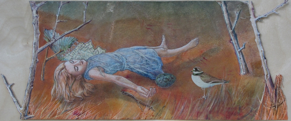
pieces by S. Davidson, Jan Boone, S. Davidson


Suzanne Fisher


 S. Davidson, Suzanne Fisher(2)


Jan Boone, Sharmon Davidson


Steven chatting with guests


And last but not least, my most important news is that I finally got a new computer.  As a Mother's Day/ birthday gift, my kids chipped in to help me buy it, we ordered the parts, and this past weekend my son came in from Virginia to build it for me...


... and voila! I'm using it right now.