Showing posts with label Book of Dreams. Show all posts

Tuesday, August 21, 2012

FINI!

It took most of the summer, but I have finally finished my "Book of Dreams".  At several points in the process, things did not go smoothly or according to plan.  You can read about the whole adventure here, here, here, here, here, and here, if you wish.  (Wow- that's a lot of "here"s! This really was more of an ongoing series than I realized.)  One of my purposes in posting each stage of the book's creation was to share my thoughts and technical processes with others who might be able to learn from my techniques- and from my mistakes.  So, if any of these posts has helped you in any way, I feel I have accomplished that goal. (Or even if my cluelessness brought  you some laughter, I'm happy to entertain!)


Front Cover


detail


detail


1st spread


detail


detail


2nd page spread


detail


3rd page spread


detail


detail


detail


open


If you recall, I had a problem with the spine, and ended up slicing it apart down the middle because it wasn't quite wide enough for the pages.  I thought long and hard about how best to fix it.  My first idea was to sew something, such as the spine of another book, over the cut, using the same stitching I used on other the pages.  I quickly realized, however, that I couldn't do that because the pages were already glued in; there was no place to put the needle through. My second thought was yikes- I've totally ruined the whole thing.  I was afraid that if I just glued some kind of paper onto it, it might not be strong enough to take the repeated opening and closing that the book was likely to have to endure, and wouldn't look right, besides.  Luckily, while looking at book binding supplies for the guest book I'm making for my daughter's wedding, I happened to see this Lineco Satin Cloth Tape.  I thought it was worth a try, so I ordered it, and it worked- in fact, the width was perfect.  But the tape was so pretty and shiny and new-looking that it seemed out of place in contrast with the old, well-used appearance of the rest of the book.  I attempted to resolve this by gluing on a 'skin' of dried acrylic gel I had peeled off from the earlier front cover fiasco.  You can see this on the photo of the back cover, below.  I'm still not sure about it, but have decided to leave it be for now.


back cover


FINI!  (The End)


Tuesday, July 31, 2012

Spread #3 of Book of Dreams

I have finished the third, and last, spread for the Book of Dreams!  (You can see earlier stages here, here, here, and here.)  This page is almost purely a monotype, with just some added watercolor pencil here and there to darken or blend the different areas of color.


 I'm still not sure that it doesn't need to be darkened a bit more, but I think I'll let it rest for a while until I can decide.

Here are few close-up details:


Unfortunately, I haven't quite solved my binding issues.  The structure of the book is actually similar to a child's board book, which I believe, in bookbinding parlance, is called a drum leaf binding


 Because mine was not done in the proper order, it is a bit wonky, but "live and learn", as they say. Thanks to Mo Crow for the link, and for all the other instructions and suggestions. 


 When I got all of the pages glued together, I discovered that the spine of the original book was only a tiny bit too small.  So, since the spine doesn't serve a structural function in this case (the end pages are glued onto the covers, not the spine), I think I may be able to do a cosmetic fix by just sewing on a strip of something(?) to hold the edges together and make it look better.


And then, I'll need to do something with the back cover, so stay tuned for more disasters and discoveries!


Tuesday, July 10, 2012

Book of Dreams middle pages + Uh-Oh

The second, and center, spread of my altered book Book of Dreams is finished.  (Click here, here and here to see earlier parts of my process.)  I'm pretty satisfied with the outcome of the pages, though I did struggle for a bit.  I regret to say that I didn't photograph earlier stages, due to the fact that I got carried away and forgot, but also because it was just too embarrassing at some points- it will have to remain my deep, dark, secret.  Kidding, of course, but it really was that kind of "what was I thinking?" ugly that you just want to forget!

Anyway, here it is:

2nd spread of Book of Dreams
ingredients: monotype on Rives BFK,image transfers, mica, metallic ink, ink jet prints, map fragments, Derwent watercolor pencils, Caran D'ache crayons, artist pens, feathers, stitching


However, I have encountered a major problem.  Leave it me to do things bass-ackwards and try to make altered books without really having much knowledge of bookbinding technique. So, here's what happened. 


I think I mentioned in one of my earlier posts that the binding of the book was in bad shape.  I also took out a bunch of pages to make room for the paintings.  Right now, the first 2-page spread is glued to the front cover.


But here's the real problem (well, one of them): When the book is open flat, the painting fits perfectly.  But when you try to close it...

not so much.  And here's the other issue... The spine of the book is very thin.  I thought that if I took out most of the pages, it would be big enough to contain 3 spreads.  But now I'm thinking...


not so much.

So, what to do?  Right now I'm considering gluing the pages together, kind of like a board book, then cutting the spine in half down the middle, and sewing a wider spine from another book onto it to hold the 2 parts together...  I dunno.

But it's been one of those days, anyway, if you know what I mean.  Have you ever started to shake a bottle of ink, thinking the top is screwed on... but it's not?

Who knew I looked so good in bronze?  This is the only way I'll ever have a tan, but it would definitely take a much bigger bottle to do the job!


Hope your day is going better than mine...

Friday, June 29, 2012

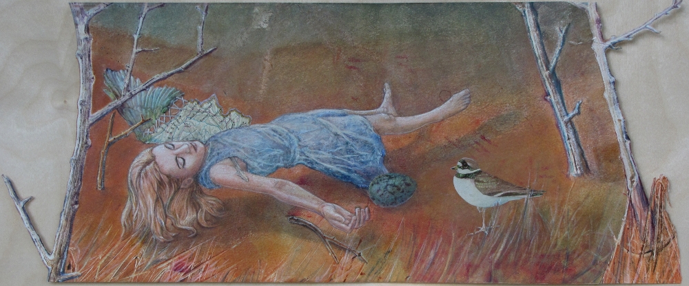
Book of Dreams Ist pages complete!

In our last episode, we saw what we thought was the final version of the 'floating girl' spread.  Sadly, I was mistaken about that- or, sadly mistaken, as my mom used to say.  I realized that the white specks I was seeing on the photos were at least partially caused by little tiny spaces where the colored pencil wasn't covering the oil-based ink of the monotype beneath it.  So, like an idiot, I repainted the entire figure,  except for the dress. That set me way back, because I was never satisfied, and therefore kept painting over what I had already painted over... Finally, I just said to myself, Stop now before you go crazy. And the surprising part is- I actually did.  Stop, I mean.  (Crazy is a whole other can of worms, which I won't go into right now.)

Now I'll go back to what I did before that, in real time.  Prior to and partially during the work on the monotype part of the spread, I had to prepare the pages in the book onto which it was going to be glued.  On both sides, I stuck the first 3 pages together to create a thicker, sturdier surface to attach everything to.  (I could not yet glue them to the book cover because I knew there was going to be stitching.)  I laid the monotype down to determine where its placement and drew around the edges so that I would know what portions of the pages would be showing when the whole spread was assembled. After gluing down some collage elements such as vintage book pages, maps, and sewing pattern pieces, image transfers of the same cuneiform letters I had used on the front cover were added.

left side collage

These were followed by the eggs, which had been printed on tracing paper.  the paper wrinkled when I tried to glue it into place, but I liked the effect, so I left it. Lastly, the stitching was done.

right side collage


right side detail


 After finishing the stitching, I glued the left side page to the back of the book cover.  I also used some book-binding tape in an attempt to further strengthen the attachment of the pages to the cover.  (You can't see all of that here.)


 At that point, it was time to glue the monotype (floating girl) into place.  But first, there were a few more details to take care of- just little tweaks here and there.  The only change of note was the addition of the feathers...


which were generously donated by my friend's pet parrot.  So here's the final version...


I think...                                           

What do you think?


Wednesday, June 20, 2012

The "Book of Dreams" Project: Monotypes, Recycling, and Binding (Oh, My!)

Hello all! Now that I can get out a bit (at least on the porch) I hope my photos will improve somewhat.  I had to discard some of the ones I took inside, because the flash reflected off the shinier parts of the piece, making it difficult to see what it actually looked like.  Of course, I will unify everything when it's finished, by using the proper surface coatings, but I'm not ready to do that yet. With the varied surfaces that are unavoidable when using mixed media, this is another issue that has to be resolved in the end.


This is part of the first inside page spread for the Book of Dreams.  Since the text block of the original vintage book has largely come loose from the cover, I thought that if I used single page 'signatures' (I know they're not really signatures, but I'm trying give you a clear visual here- and probably not succeeding.), made from sturdy, durable material, it would help to bind the pages to the cover more securely.  Not really being very experienced with book-binding techniques, I'm not sure if this will work, but it seems logical to me.

What I decided to do, then, was to recycle parts of an old monotype that wasn't successful.  It's a  method that usually works out well for me, because it gives me layers of color and images on which to build.  Being a big layer-er, it functions as kind of a head start, and the additional layers tend to yield a richer piece with increased depth.  Of course, I first needed to come up with a scrap piece that fit in with my vision; I had an idea of the one I wanted to use, and luckily it worked out.

First I played around with fitting the appropriate section of the scrap piece to the page; when satisfied with the composition, I cut out the parts I wanted.  In this particular case, the figure was already there, but had to be significantly modified.  I won't describe all this in detail, but one major thing I changed was her dress, which looked really floopy.  (Yes, this is a word, at least in my head...)  I took a piece of gampi (also called silk tissue) and tried to make it fold where the folds in the dress should be, gluing it down with gobs of acrylic medium as I went.  Though it didn't turn out the way I had hoped, I decided it was acceptable; to me, it looked a bit like encaustic, or maybe like her dress was made of ice, or water.  Sometimes, you just have to go with the flow, people.

The wing was added, part map and part feathers (the feathered part came from Wing of a Roller by Durer), and then the stitching to connect them.  I made several other changes and additions- everything from adding more grass, as well as the egg and the bird, to changing the shadows, and removing things from the sky and other areas.  The thing I love about Rives BFK is that it can take the abuse of some pretty aggressive washing and erasing.  I did still tear up a few spots; this is where creative improvisation comes in (otherwise known as gluing something over it if all else fails).


This post is getting longer than I intended, so I think I'll continue later with the alterations and collage work I did in the pages of the book itself before gluing the monotype in place, and, of course, with the completion of this spread.  Be sure to check back for that update, and as usual, I'd be happy to answer any questions you may have about materials, methods, or techniques.  Also, I would love to read your ideas and advice, if you're so inclined.


Monday, June 11, 2012

The Process So Far

A couple of posts ago, I showed you the new altered book piece I'm working on, entitled Book of Dreams. A lot has happened since then- I got a new computer, the school year (finally!) ended, the Figuratively Speaking exhibit opened, and then, on Sunday- I broke my ankle.  I still can't believe it myself- just strolling along the creek side, anticipating a fun and leisurely search for good junk that the Spring rains might have washed down to the island (or, as the ER nurse put on the report, "looking for art materials"), I put my foot on a rock, slipped, heard a snapping sound, and found my self lying in the rocks and mud.

So, my point is, somewhere in between all those events, I was still working on the piece, a bit at a time. Not so much since the ankle fiasco, which I think you probably could have already deduced on your own, right?  And, since I did not hit my head when I fell (why did the ER staff keep asking me that?), I still remember that I had promised to give you a step-by-step overview of my process.  So, here goes.


I started with the front cover, which I envisioned as the gateway to the realm of dreams.  I wanted to use the sphinx from a piece I had made and sold several years ago, so I used photoshop to cut out the figure, then printed it out to use as a transfer.  My idea here was to do an acrylic gel transfer of an inkjet image, hoping that, if I lucked out, the resulting poor-quality transfer would have the appearance of a worn, faded illustration on the cover of a very old and forgotten storybook. (Gel transfers work best with toner-based ink, not inkjet.)  I knew it would probably be a big bloppy mess, but I gave it a try, and to my great surprise, it worked perfectly.  Unfortunately, the acrylic medium soon began to peel off the surface of the book cover, which was more smooth and slippery-feeling than covers I'd previously work on. Ultimately, I had to peel it off and re-do the transfer four more times, including a good deal of sanding, gessoing, and scraping; it never did look as good as it had the first time, though.

Before doing any more work on the sphinx, I glued on the map pieces and dress pattern piece that form the bottom/foreground, as well as the dress pattern pieces that form the rectangular 'door' area.  Images of cuneiform characters were transferred onto the rectangular door, and transfers of the botanical illustrations were layered on top of the other images.  Acrylic paint, inks, watercolor pencils and crayons, and artist pens were used to enhance the sphinx and other parts of the drawing.

I used my awl to punch holes in the book cover for the stitching, which was done with embroidery floss. After quite a bit of debating, I decided to make the letters for "Book of Dreams" from the cuneiform characters, cutting, turning, and/or altering them to make them look like English letters.  Though it initially seems to work, I'm not sure how I feel about it yet.

The "door" is an old brass escutcheon that I bought on etsy, and attached with brads; the "doorknob" is strange sort of screwpost thingamabobby I bought somewhere.


Well, that's the first installment; I hope my explanations were more helpful than confusing.  I'm never sure if I'm including enough information, or rattling on way too much, so please let me know.  If there are things I didn't explain well, or you just want to know more than what I addressed, please feel free to ask.  Likewise, if there are easier or more efficient ways to do things, don't hesitate to share these with me.  I'll also be talking more about some of the materials I use, as I continue to share my process throughout this project.


Thursday, May 10, 2012

I'm still working...

Even though I haven't been posting much, it's not because I'm not working; it's just difficult to process photos right now.  But I did want to give you a little peek at what's going on in the studio.  I'm hoping I was able to make the photo small enough so that it can download without too much trouble.  I guess we'll find out!


This is a work in progress called "Book of Dreams."  An art organization (The Print Club) of which I'm a member will be having an exhibit at Northern Kentucky University in February, with the theme "In Your Dreams."  As of now, I plan to exhibit this piece, along with some others, if it's not "an epic fail", as my students would say. This is just the front cover, and even it has a long way to go.

Ingredients so far include: vintage book, maps, vintage dress pattern, image transfers, watercolor pencils (Derwent), artist pens (Pitt and Artline), acrylic ink.


I'll try to remember to take photos of this as it evolves, and post them regularly.  Also, I'll attempt to describe the process in a somewhat step-by-step manner, beginning with the next post, because right now I'm doing special ed paperwork!

And, as always,

Shepherd Fairey