Showing posts with label The Traveler's Tale. Show all posts

Sunday, October 31, 2010

The Traveler Goes Trick-or-Treating

Well, not really, but it sounds a lot better than "The Traveler goes Halloweenish"- though the second one does sound like something I'd say.  I'm starting the 5th piece in The Traveler's Tale, a series of large collages I've been working on intermittently since the spring of 2009.  Maps are the main material used in the series, which is somewhat narrative, as each piece "tells a story" about the same character.  And this one is, well- kind of spooky.

 This is an old monotype that I started re-working.  It's actually a "ghost image", so called because it's a second impression, made using only the ink that's left after the plate has been printed. 


I started re-drawing the figure; I'm not finished yet, and you can see that many of the lines and shadows aren't really in the right place.  But this is just the preliminary stage of planning for me- like thinking aloud on paper.


This drawing of a model inside a piece of stretchy fabric was transferred onto frosted acetate so I could see through it.  Somehow it will have to be transferred onto the monotype, but at this point I haven't figured out exactly how I'm going to do that.  I think I'll need to enlarge it a bit so that both figures will be closer to the same size...


It still has a long way to go, but here's the general idea:


And a detail:

It is rather Halloweenish, you see?


If you're not familiar with the series, here's a look at the first four.


The Traveler's Tale: As the Crow Flies

The Traveler's Tale: Balance

The Traveler's Tale: Once Upon a Time

The Traveler's Tale: Self-Birthing


I'd really welcome and appreciate any comments, criticisms, or suggestions about the new piece.  Have a blessedly spooky Halloween!

Sunday, February 21, 2010

The Traveler's Tale: Self-Birthing


The photo's not the greatest, but I think this is just about finished.   Here are a couple of details for your perusal.


I added some "starfish" (ha!) to the sky, and more detail and color to the moon.


I kept the "blue stuff" on the bottom, sort of; I actually covered it with a lighter blue map.  I felt it was too bright before.


I also added bits of yellow and pink to the figure, so she wouldn't look so- dead.


What do you think?  All comments/ suggestions/ opinions are welcome!


Oops- I almost forgot to ask what you think of my new blog template and header!

I would also be remiss if I didn't tell you to check out my secret today at The Altered Page, because it's


Saturday, February 6, 2010

New Work on the Easel

It took me so long to finish The Traveler's Tale: Once Upon a Time, you thought I was a big ol' lazy slacker, am I right?  Well, you're right, but also wrong.  While I procrastinated on the final steps of that piece, I actually started working on a new one.   (If you haven't seen the progression, here are Once Upon a Time 1; Once upon a Time 2; Once Upon a Time 3; Once Upon a Time 4; Once Upon a Time 5; Once Upon a Time 6. )

I began with an old monotype of a woman floating in the water, which I cut down to a smaller size, making the figure a larger and more prominent part of the composition.  Because the figure was already there, I had a 'template', so to speak, which saved quite a bit of time.  I decided to use three values for the figure this time, instead of just two.  Once I decided where to delineate those, I cut and glued the map pieces.  Instead of maps, I used some monotype  fern pieces for her hair.


  .
I'm not totally satisfied with it, but it's coming along.  The hair still needs some work.  I made the moon out of a large white map with nice blue lakes, then added some shading and craters to make it more 'moonish'.   I don't know what I want to do with the sky, and I'm not at all sure about the blue stuff at the bottom.  Any ideas?


Well, this is it, so far.  I welcome all comments, questions, suggestions, and answers.

Tuesday, January 26, 2010

The Traveler's Tale: Once Upon a Time (snake- free!)

I did it!   I got very tired of scraping the snakes off, but I finally sucked it up and finished it!   Just a few little tweaks here and there, and it will be ready for the final photo.  With apologies for the quality of the photo, what do you think?

Tuesday, December 29, 2009

93.314% finished

I'm happy to say that I'm almost finished with the 3rd "The Traveler's Tale" piece!  Thanks to all of you, my dear friends, who were kind enough to share your suggestions and opinions.   Here's the "nearly finished" version of The Traveler's Tale: Once Upon a Time.


As you can see, I have added a few more details; most importantly the figure now has a face!  I still need to work more on the sky, and do some little touch-ups, such as coloring in all the white edges.  Also, there will be red stitching forming the dragons' reins; she'll be holding the ends in her hands.


I had tried making the darker value of the figure red, and didn't like it.  But many of you seemed to like the red hair in the last update, which was not intended to be permanent.
So, I reconsidered and came to a "compromise" of sorts, by putting some red into the purple hair.  (That really sounds weird if you think about it.)  I think it works, don't you?    If not, please let me know- seriously!

And, last but not least, I still have to get those blasted snakes out of the sky!  (Wow, talk about sounding weird...)


Suggestions, anyone?


Tuesday, December 22, 2009

Still Working On It


Remember this?  In previous posts I shared my compositional woes and color conundrums as I tried to work my way through the third in my "Traveler's Tale" series.  I thought this would be the easiest one, but I guess I still haven't gotten past that learning curve, if you know what I mean.  


I was really hoping to finish this before Christmas; there are other ideas I want to start working on before my break is over.  Also, this is what my drafting table looks like right now, and there's no sense in putting anything away when I'm going to need it again in five minutes. What a mess, huh? I decided I didn't like the map I'd chosen for the traveler figure, and I thought she was too small as well.

So, I enlarged her, and decided to cut her out of a blue map, using red for the shadow value.  I thought these colors would look more like the ones you see in fairy tale books or medieval paintings.  However, I tried several different reds, and they all looked pretty icky.  I didn't take pictures of these incarnations; believe me, you're not missing anything.

So, this is where I am now.  (Sorry, this picture is pretty wonky.)  Her hair is still one of the horrible reds I tried; I haven't changed that yet.  I couldn't think of anything else to do except to make the shadow value purple.  Green was the only other possibility, but I was afraid it would not contrast enough with the background, or with the blue.  I've also added some more fairy tale-ish elements to the piece, such as the dragons, the book with evil queen inside, the mirror, apples, flowers, and a story-book border...

What do you think?  If you have any ideas, please let me know.  Maybe, with your help, I'll finish it by Christmas!

Wednesday, November 11, 2009

Still Pluggin' Away


Last week I sketched the figure for the 3rd of the Traveler's Tale series.  (You can see part 1 of my process here, and part 2 here.)   I glued down the castle and the tree, and added a little to the path that goes up the hillI always do my sketches on tracing paper so I can see more accurately how to place it, and what it will look like once it's there.  
I had a hard time with this figure, because I didn't have a live model or even a good picture to work from.  On top of that, it's quite difficult to distill a figure down to only two values.  It gives me a newfound respect for those 60's blacklight poster artists, let me tell you!

I debated with myself for a long time about whether she should be clothed.  On one hand, I wanted her to look like a stranger in a strange land, but then I just couldn't see it working with a bare butt in front of a castle- I thought that might seem so much out of place as to be distracting.  In addition, I thought maybe her dress flowing into/ merging with the pathway might be a nice compositional element.  So, I decided to go with the dress.  (Don't you just adore knowing my every mundane little thought? Ha!)


I then took the sketch of the figure and placed it on the map I had chosen, taping it down carefully with artist's tape.


Then I put the handy-dandy transfer paper underneath and went over the lines to transfer the image onto the map.


Using my trusty x-acto knife, I slowly and carefully cut out the figure.  I taped it onto the piece to see how it would look...


...and I think it looks too small!  Yikes!  It looked fine on the sketch- what's up with that?  Also, I really don't like the map I chose for the figure; it's too busy, too many words and things.  And I still have no idea what I'm going to do about those snakes in the sky.  Where's St. Patrick when you need him?

Well, I guess it's back to the drawing board...

Monday, November 9, 2009

The Traveler's Tale: Balance


I finally got a photo of the second piece in the Traveler series, which I had finished a few weeks ago.  I am now working on the third, tentatively called "Long Ago and Far Away".  So far, this second one has been the hardest; I knew what I wanted the figure to look like, but the background was a *&#^@!   The original sky map was printed in 1957, and I knew I would never find another one, so I scanned it.  Of course, my scanner only accepts up to size 8.5 x 11 inches, so I had to then try to splice the pieces together.  The map doesn't quite look like this either, as I wanted the circle to go all the way around, which it does not because in the past I have cut pieces out and used them, not anticipating that I'd do a whole series like this!  Lots of improvisation was involved.  It took me weeks just to find the right maps for the bottom part, and the right way to combine them, as well as what and how to incorporate the "land" she's walking toward.  But overall, I'm pretty pleased with the result.  What do you think?

Wednesday, October 14, 2009

In Progress

I thought I'd share with you the making of an artwork from start to finish... sort of. This is the third of my "The Traveler's Tale" series so far. This series is more narrative than my usual work, and is loosely based on the theme of the journey of life, both inner/mental/spiritual, and physical/temporal- not that these are by any means two separate things. I've always loved maps, and thought they were really beautiful; I've used them before in a few pieces, with interesting results. Here are a couple of examples:

Pathways of Remembrance
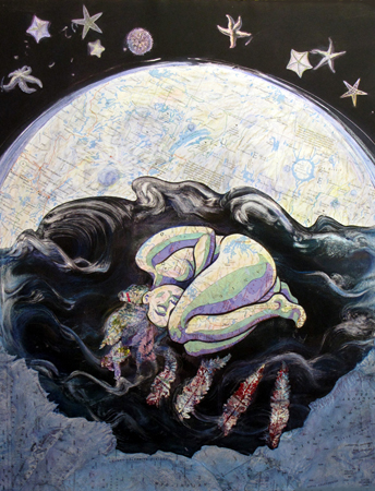
Dharma Mandala

For "The Traveler's Tale", I'm using maps as the dominant collage material. You can see the first one, "As the crow Flies", here. The second is finished, but has not yet been photographed; I'm just slow, lazy, too busy, or all of the above. Hopefully I'll get to that soon, if the weather cooperates.

After I have the general composition worked out in my head (I haven't done rough sketches for these because the exact composition depends too much on materials), the first thing I have to do is find the right background materials. This is really the most difficult part of the process, because the image in my head does not always coincide with available materials, so constant revisions are made as I try to come to the best compromise.

For instance, what's the overall size? If I have map pieces that fit, they may be the wrong color, or have the wrong "mood" for the piece. For example, a Cincinnati street map is not going to look right if the piece has a medieval theme. But how much can I splice parts of maps together without making it look too sloppy or visually confusing? For this one, I wanted the hill to be one map, if possible, so this greatly limited my choices, as I had only a few that were large enough. Color, of course, is another important factor.

I chose the map of British Columbia because it was the only light-colored one that was big enough. For the sky, I wanted to use part of an old monotype. It wasn't really big enough, though, so I knew I'd have to supplement it with something else- hopefully the blue ocean part of the map. So I fiddled and jiggled and moved things around approximately 2 or 3 hundred times, taping things in place with artist's tape (not supposed to tear the paper), and then moving them again. Too many variables!! Eventually I get tired of this and just decide to go with what I've got at this point.

So, I glued the map piece on. As you can imagine, gluing something so huge (the overall size is about 20 x 27) can be quite problematic. For pieces this large, I use Grafix double- tack mounting film, but great care must be taken because if you put it down in the wrong spot, that's where it stays! It's great, though, because there's no wrinkling. I also attached a couple of extra map pieces, such as the one I added at the top of the hill, to make it a little taller.

The monotype I used had a tree on it which overlapped the sky too much to make it feasibly removable, so I decided I'd have to keep it. Sometimes you just have to go with the flow, right? I cut around the part of the tree that extended below the sky, then glued the sky on using the same mounting film.


Next I brewed up a mixture of acrylic inks to stain the map an appropriate color. I rubbed this on with a rag that was formerly an old cotton t-shirt, and VOILA!

Here is the new piece, so far.

Tune in next time, when we venture into the exciting and dangerous realm of (dhunt-dhunt-DHUN) IMAGE TRANSFER!