
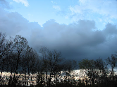
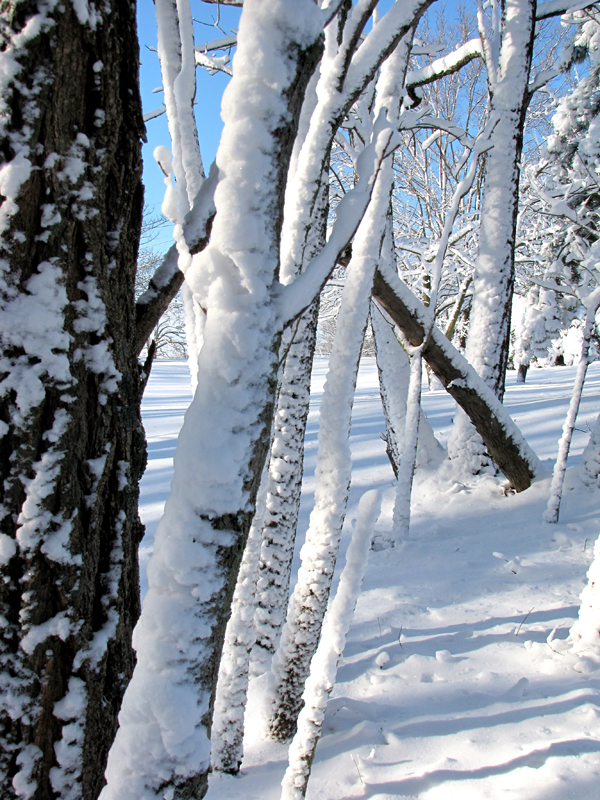
It could be said that I'm addicted to color, and I would freely admit it. I don't know about where you live, but here, it's been, as George would say, (little darlin') "a long, cold lonely winter". I'm ready for Spring, I'm tired of gray and brown, so I say here comes the color!
Marketing researchers have spent considerable amounts of money trying to figure out the psychological effects of colors. Of course, it's not an exact science, because each person has his/her own unique associations with colors, resulting from personal experience. But there are some associations that tend to hold true for most people. See if you agree.
WHITE

GRAY


GREEN

BLUE
PURPLE

PINK

BROWN

Some of the associations seem a little odd, but for the most part, they make sense to me. I got the color association information from a cool art therapy website; you can read more about it here.
Now that we've considered each color separately, lets mix them all together, shall we?
These incredible large-scale installations by Mexican fiber artist Gabriel Dawe certainly encompass the entire color spectrum.


And now, for the final color overdose; check out this video of artist Holton Rower at work! (Turn up the sound, too; the music is great.)
Marketing researchers have spent considerable amounts of money trying to figure out the psychological effects of colors. Of course, it's not an exact science, because each person has his/her own unique associations with colors, resulting from personal experience. But there are some associations that tend to hold true for most people. See if you agree.
WHITE
- purity
- innocence
- cleanliness
- sense of space
- neutrality
- mourning (in some cultures/societies)
GRAY

- neutral
- timeless
- practical
BLACK

- authority
- power
- strength
- evil
- intelligence
- thinning / slimming
- death or mourning
RED

- love
- romance
- gentle
- warmth
- comfort
- energy
- excitement
- intensity
- life
- blood
ORANGE

- happy
- energetic
- excitement
- enthusiasm
- warmth
- wealth prosperity
- sophistication
- change
- stimulation
YELLOW

- happiness
- laughter
- cheery
- warmth
- optimism
- hunger
- intensity
- frustration
- anger
- attention-getting

- natural
- cool
- growth
- money
- health
- envy
- tranquility
- harmony
- calmness
- fertility
BLUE

- calmness
- serenity
- cold
- uncaring
- wisdom
- loyalty
- truth
- focused
- un-appetizing
PURPLE

- royalty
- wealth
- sophistication
- wisdom
- exotic
- spiritual
- prosperity
- respect
- mystery
PINK

- romance
- love
- gentle
- calming
- agitation
BROWN

- reliability
- stability
- friendship
- sadness
- warmth
- comfort
- security
- natural
- organic
- mourning (in some cultures/societies)
Some of the associations seem a little odd, but for the most part, they make sense to me. I got the color association information from a cool art therapy website; you can read more about it here.
Now that we've considered each color separately, lets mix them all together, shall we?
These incredible large-scale installations by Mexican fiber artist Gabriel Dawe certainly encompass the entire color spectrum.

Plexus 3 by Gabriel Dawe

Plexus 3

Plexus 2 by Gabriel Dawe

Plexus 4 by Gabriel Dawe
To see more of Gabriel's work, visit his website, here.
And now, for the final color overdose; check out this video of artist Holton Rower at work! (Turn up the sound, too; the music is great.)
I find this video mesmerizing! Okay, maybe I am easily amused, but I hope you enjoy it as well. I also hope you enjoyed my little color tour! Thanks to my son, Colin Reusch, for sending me the links to these two artists.
sharmon , this has just blown me away. I always check blogs before starting to work each day - this has really set me up!!! awesome paint pouring thing. wonder what kind of paint they use that the colours don't mix and end up like your plastecine did when you were a kid?
ReplyDeleteglad you liked the Dali tarot - I thought you would!
Gorgeous, fabulous, energizing color!!! Thanks for sharing both of these artists, and all the color info Sharmon. The soft etherial quality of Gabriel Dawe's fiber work has almost the opposite effect on me that the paint pouring does - soothing, calm, misty magic, while Holton Rower's is a dynamic jolt - a joyful celebration of color. Both fabulous!!
ReplyDeleteBeautiful!
ReplyDeleteI LOVED that video and your pictures and explanations of color are wonderful - I am a big fan of color too (I guess we all are ;) and am planning something special this Summer based upon color.
Thanks for the inspiration - and I love your blog - I will be back as I am now a follower ;) Kristin xo
Ok that was very "trippy" indeed. I do think my husband needs utilize Holton Rower's idea. Where he works he could do this as a team building thingy-... We (the proverbial we) make the pigment that goes into color. Boy would that be a fun thing to do! thanks again for a great post. Yippy for COLOR!
ReplyDeletewow the plexus stuff is amazing - fine and like a 3d visual puzzle.
ReplyDeleteThank for showing it, I am off to check it out/
Great stuff- the video is cool- the music? Michael Nyman or Philip Glass?
ReplyDeleteNow that was FUN! For some reason your postings were not showing up on my "thingy" so I am enjoying reading them. Love reading the color associations and that video...wow! lol, my word verification is READMORE..
ReplyDeleteGorgeous post Sharmon!
ReplyDeletewonderful to visit...
S
Fabulous to find your blog and read all the wonderful entries. This one on colour is particularly mesmerizing.
ReplyDeletemakes me recall the different colors i had in my backyard of Spring dogwoods in the city vs here with pine and water and sky ... color has also a lot of personal doors and whirligigs for me too.
ReplyDeletelove that you mixed all the colors on your post later, as we are so full of multi-talented light!
Oh, how wonderful is this! I love that you shared them separately first. That green... yum. I love me the colors.
ReplyDelete