Wednesday, September 30, 2009

Unknowns and White Fuzzies

The last of the fall wildflower photos- maybe. Despite all my diligent research in Wildflowers and Ferns of Kentucky by Thomas G. Barnes and S. Wilson Francis, I was unable to figure out what these are called. Of course, I had to make up my own names just so I could recognize the files on my computer, but hopefully some day I'll find out what their real names are. I hope you like them.


I call this one the Yellow Mystery Flower. I've never seen anything like it before, and I think it's rather cool. The bumblebee concurred.


Here's another unidentified flower, which I'm calling the Snowball for now. Again, I found nothing like it in the book. Maybe I've found a new species!?


This is just a little seed that I thought looked like a little guy with white hair dancing in the wind. And no, I was NOT drinking!

If you have any idea about the identity of the first two, though, please let me know.

Thursday, September 24, 2009

Sunflowers and Asters, and Dogs (oh, my!)

When I go out on a photo expedition, I'm lucky to have my three wonderful assistants with me at all times- whether I want them or not. They're always happy to protect me from the trees, shake water on me (and the camera) after swimming in the creek, and stomp on the flower I'm trying to photograph. In spite of all that, for some reason I still love them. So here are some more photos I took with their help, as well as the little assistants themselves.

Tickseed Sunflowers ((Bidens aristosta) with Great Blue Lobelia (Lobelia siphilitica)


Heart-leaved Aster, Blue wood Aster (Aster cordifolius)

My genius photographic assistants

The Amazing Sunny- holds the world's record for most time spent barking for absolutely no reason

Scout, the Herder- freaks out if her sheep (that's us) get too far apart

Arlo, the spoiled brat, champion mud-wallower and flower-stomper-in-chief

Tuesday, September 22, 2009

Cardinal Flowers, Alizarin Crimson, and Donovan

Here are a few wildflower photos I took last weekend out at our place on the Kinneyconnick. I guess you can tell the cardinal flower is my favorite- probably because it's the only wildflower I've seen in this area that's really red. This flower is REALLY red, no photoshop enhancements necessary. (Alizarin crimson, perhaps?) As evidenced by my artwork, I love intense, saturated color; I believe it's one of the sublime ecstasies of life!

Mist Flower (Eupatorium coelestinum)

Meadow Phlox (Phlox maculata) or Fall Phlox (Phlox paniculata)

Four views of the showy Cardinal Flower (Lobelia cardinalis):


Alizarin- a red dye originally obtained from the root of the common madder plant, Rubia tinctorum, in which it occurs combined with the sugars xylose and glucose. The cultivation of madder and the use of its ground root for dyeing by the complicated Turkey red process were known in ancient India, Persia, and Egypt; the use spread to Asia Minor about the 10th century and was introduced into Europe in the 13th.


As Donovan says, wear your love like heaven!

Saturday, September 19, 2009

Another Obsession?

As I got more involved in photographing and identifying the wildflowers of Lewis County, I began to entertain the idea of trying to find every wildflower that grows on our sixty acres of land. Luckily, I soon realized that this would be ridiculous (yes, there are times when I'm struck by sudden bouts of sanity). I have finally learned that there is a limit to the number of major activities that I can divide my time into (yay, me!), and have realized, in addition, that I have to prioritize. I have a full time job as a teacher, and another full time job as an artist. I am also working on building a log house from- well, logs; what I mean is, it's not a kit. Then throw in a few details like caring for the house and yard, my dogs, and...well, life stuff. So, no big wildflower project, but I will continue to share with you the flowers I meet by chance.

Queen Anne's Lace (Daucus carota)

Pokeweed (Phytolacca americana)

Lamb's Ear

Tall Bellflower (Campanula americana)


Field Milkwort (Polygala sanguinea)

Friday, September 18, 2009

Wednesday, September 16, 2009

Goodbye to Summer

The end of summer is always a bittersweet time for me: while I do love the cool, crisp days of fall, I'm just not that fond of winter. The winter skies in Kentucky are gray and cloudy much of the time, and since we don't usually have much snow, everything else is just dirty brown. It's such a contrast to the lush growth of the other three seasons, which spoil us with rich emerald greens and golds, purples, pinks, oranges, and reds. Maybe it's because I'm a teacher, but winter just seems to last forever!
At this time of year, the plants appear determined to put on one big final show. It's like they're saying, "Uh-oh, we're running out of time- better set some seeds right now!" The blooms burst forth in a profusion of mostly purple and yellow, and it's easy to be lulled into the belief that summer will never end. Here are some photos of the wildflowers of late summer, taken in Lewis County, Kentucky. I hope you enjoy them!


These three are either Downy Lobelia (Lobelia puberula) or Great Blue Lobelia (Lobelia spihilitica), or some of each.


Heal-all (Prunella vulgaris)


Joe-pye weed and Ironweed


Joe-pye weed (Eupatorium fistulosum)


Ironweed (Vernonia gigantica)


Tune in next time for more wildflowers!

Thursday, September 10, 2009

About My Process

I'm often asked about the process and techniques I use to create my work. My answer is usually something along the lines of, "Well, uh...uum..." I don't mean to be cryptic or secretive, it's just hard to explain. It can't be neatly summed up using words or phrases that everyone understands, such as, "watercolor on paper" or "etching" or even "collage." "Mixed media" is pretty vague, and covers almost anything from altered photographs to assemblage/sculpture. My process is difficult to describe partly because it's something I came up with on my own, and partly because many people aren't familiar with the terminology; the word "monotype", for instance, requires an explanation of its own. So here's my attempt to outline it as concisely as possible, and hopefully, without boring anyone to death.

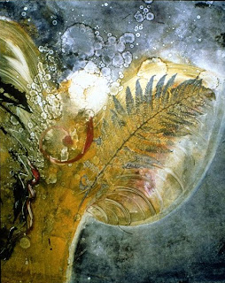
My process for these mixed media pieces usually begins with a monotype serving as the base layer, to which I later add further layers of color. A monotype is basically a hand-pulled print that, put simply, amounts to transferring a painting onto paper. No "plate" is created, so only one image can be printed- hence the term "mono-". (For more info about monotypes and monoprints, click here.) The only exception in this process is that occasionally I use a watercolor painting as the base layer. The monotype itself consists of many layers of lithographic ink, thinned to transparency in order to allow the colors of previous layers to show through. In this way, I believe the mixing of colors to be richer and more varied than if I pre-mixed the inks in advance. Normally there are at least three to six passes through the press, with leaves and other plant materials included in at least some of the pressings. All of these pieces are done on a substrate of Rives BFK 100% cotton printmaking paper; inks and other materials are as archival and lightfast as possible.


Star Being II
This piece is almost entirely monotype, with very little added media.

After the monotype is dry, layers of watercolor, colored pencil, and other (mainly transparent) media are added. If any collage elements are included, they are pieces of my own monotypes or other original artwork produced by me. With this layering process, I hope to achieve a certain luminosity and brilliance, as well as a blending and unity of images. This unity is an objective in conveying the content of my work. The process I use in creating these pieces is one that I developed myself through trial and error, in an effort to achieve the result I desired.


In Angel of the Sunrise, above, I have used more additional media than in Star Being II. The wings have been defined with Caran D'Ache crayons, and parts of the background have been darkened and unified with transparent acrylic inks and paint.


Deep in the Sea of Dreams
The piece above has had many more additions than Angel of the Sunrise. The sleeping face was done with metallic oil paint sticks; I also used these to add shine to the fish. The fish itself was drawn with acrylic ink and watercolor pencils. This one also contains collage elements, such as the "third eye" and some of the plants, which were cut from old monotypes.


The images are formed from the vocabulary of symbols that I’ve developed as I sought to express the theme that lies at the foundation of it all: a deep belief in the unity and connectedness of everything in the universe. Related to this is my conviction that every part of the earth is sacred, including the myriad beings that ride it through space. At the most basic level, we are made of the same stuff as the stars, the trees, the air, the ocean. Having come from the same source, we are all connected in the most intricate ways, both visible and invisible. This belief is expressed by the transposition of objects, the overlapping of transparent images, and by forms that seem to transform into something else. I'm constantly searching for more effective methods of revealing this mystery.

Saturday, September 5, 2009

Transformation 38


38 and counting. I'm not too sure about this one, which was actually made before #37. I held off calling it "finished" because I was hoping I'd think of a way to make it better. Nothing occurred. If you have any ideas, let me know; I never hesitate to tear something apart and start over. Recycling or re-recycling- it's all good.

Wednesday, September 2, 2009

Business Questions/ Issues


Okay, maybe I'm crazy- never mind, the jury's pretty much in on that one- but do these images look the same to you? (not counting the business card part, of course) The top one is the original artwork, and the pic on the business card should be the same. They look alike in the folder on my computer, but when I post it- well, the colors are sort of - different, to say the least. I've tried it 3 times. Also, the background of the card is black, not gray. I sent this to a printer, and now I'm wondering if this is what it will look like when it's printed. Yikes! Does anyone understand what happened?


Mystery solved. My son explained that it looked that way because the printing company wanted it in CMYK color mode, instead of RGB, which is used on the internet. Who knew? Apparently not me. So this is what my business card will finally look like.

Now I move on to issue #2: Shipping artwork. It's not really the HOW to ship that I'm wondering about, it's the WHETHER to ship at all. Or maybe it's HOW to afford to ship. To put it more simply, is it even worthwhile to enter shows that aren't close enough to enable you to deliver the work yourself? The price of shipping seems to be rising dramatically. I recently shipped a piece to an exhibit in Jasper, Indiana, near Evansville, which is probably about 4 hours from where I live. It cost me almost $80.00 to ship it there and back! Is there a cheaper way to ship than UPS? What it comes down to is that unless I make a sale or win an award, I'm out a lot of money. So, do I stop entering shows altogether, only enter the few close to home, or win the lottery?